Remember that time you picked up a brochure and it was a jumbled mess, confusing and ultimately useless? Frustrating, right? Well, that’s what we want to avoid! This guide will provide you with all the knowledge you need to create amazing brochures, focusing specifically on 8 page brochure printing. We’ll explore everything from design tips to printing options, so you can make a brochure that grabs attention and gets results. You’ll learn how to craft compelling content, choose the right paper, and ensure your final product looks professional. This will help you create better marketing materials and drive more engagement, making your efforts more effective.
Key Takeaways
- Learn the essential elements of an effective 8 page brochure printing design.
- Discover the best paper types and finishes for impactful results.
- Understand different folding options and how they affect the presentation.
- Explore cost considerations and factors influencing printing expenses.
- Find valuable tips for content creation that engages your target audience.
- Get insights into proofing and preparing your file for high-quality printing.
Crafting a Compelling Brochure
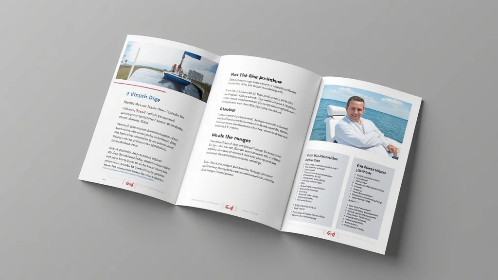
Creating a great brochure starts with understanding the fundamentals. Think of your brochure as a miniature storybook. It needs a beginning (the cover), a middle (the body pages), and an end (the back cover). Each part has a purpose. The cover grabs attention, the inner pages provide information, and the back cover offers a call to action. To achieve success, you must think about your audience and their needs. What information are they seeking? What will compel them to take the next step, like visiting your website or making a purchase? Carefully consider the information to be conveyed and how it can be structured for maximum impact.
Defining Your Objective
Before putting pen to paper (or mouse to screen), figure out your brochure’s purpose. Are you trying to boost sales, inform customers about a new service, or build brand awareness? Knowing your goal helps you make decisions about content, design, and layout. A sales brochure will have a different feel than an informational piece. A brochure focused on brand awareness will prioritize consistent branding and a clear message. Define your objective. Write it down. This acts as a compass, guiding all design choices. Without a defined objective, you may end up with a brochure that lacks focus, confusing potential customers and missing opportunities.
- Sales & Promotion: Aim to convert readers into customers, highlight product features, and encourage immediate action like making a purchase. The content would focus on the benefits, special offers, and clear calls to action.
- Information & Education: Provide detailed information, explain complex topics, or educate readers about your company. Focus on clarity, accuracy, and ease of understanding. This type of brochure often benefits from the use of charts, infographics, and visuals to simplify the message.
- Brand Awareness: Build brand recognition, showcase values, and make a memorable impression. Prioritize brand consistency, including logos, colors, and typography. The goal is to create a positive association and reinforce brand identity.
- Event Promotion: Publicize events, workshops, or conferences. The focus should be on date, time, location, speakers, and reasons to attend. Include engaging visuals and a clear registration process.
Knowing Your Audience
Your target audience is the people you’re hoping to reach. Are they young professionals, senior citizens, or families? Understanding their interests, needs, and preferences will help you customize your message. Think about their lifestyle, what they value, and the kind of information they are likely looking for. The more you know about your audience, the better you can customize your design and messaging to resonate with them. Ask questions like, “What problems do they have that we can solve?” or “What kind of language do they use?” Research your audience to ensure that your brochure is effective.
- Age and Demographics: Younger audiences respond to modern designs and quick facts. Older audiences appreciate clear, concise information and easy-to-read fonts.
- Interests and Hobbies: Understanding their passions helps you tailor the content and select visuals. If they enjoy outdoor activities, showcase images of nature.
- Needs and Pain Points: Show how your offering solves problems and addresses needs. If they’re looking for a solution, position your product or service as the answer.
- Language and Tone: Use the language and tone that resonates with your audience. Avoid jargon that they may not understand, and use a friendly or formal tone that suits your audience’s communication style.
Developing Your Brochure’s Content
The content is the heart of your brochure. It needs to be informative, engaging, and easy to understand. Start by creating an outline, so you have a solid structure. Break down your message into short, easy-to-read sections. Use headlines, subheadings, and bullet points to guide the reader. Your headline needs to grab attention and quickly communicate the brochure’s purpose. The supporting text should provide key details and encourage the reader to learn more. Always keep your content concise, focusing on the most important information.
- Headline and Subheadings: Use strong headlines and subheadings to draw attention and break up content. Your headline needs to instantly grab the reader’s interest. Subheadings then guide the reader through the information.
- Compelling Body Text: Write concise, engaging content that addresses your audience’s needs and interests. Focus on the benefits of your offering and provide essential details.
- Call to Action: Encourage the reader to take a specific action. A clear and direct call to action tells the reader exactly what to do next. Examples include “Visit our website,” “Call us today,” or “Sign up now.”
- High-Quality Visuals: Use images, graphics, and illustrations to break up text and make your brochure visually appealing. High-quality visuals greatly increase interest and engagement.
Design Principles for Effective Brochures
Great design makes your 8 page brochure printing stand out. It creates visual interest, guides the eye, and enhances your message. Consider the layout, the use of white space, and the overall look. A well-designed brochure is easy to read, visually appealing, and reflects your brand identity. Proper design can increase the impact of your marketing materials. Good design is a key element in making your brochure memorable and effective.
Layout and Structure
The layout is how you arrange elements like text, images, and graphics. A good layout provides a clear visual flow, making it easy for readers to follow the information. Think about balance, where elements are arranged to create visual harmony. Experiment with different layouts, like using grids to organize content. The structure helps guide the reader through your message. Consider creating a clear hierarchy. This means the most important information is emphasized, drawing the reader’s eye. Keep it uncluttered, so the readers are not overwhelmed with text or visual distractions.
- Grid Systems: Use a grid to create a consistent and organized layout. Grids provide structure, making it easier to align elements and create a professional look. A grid system will improve the overall aesthetic and readability.
- White Space: Also known as negative space, white space is the empty space around text and images. White space creates visual breathing room, making the brochure easier to read and less cluttered. It also helps to highlight the most important elements.
- Visual Hierarchy: Arrange elements to guide the reader’s eye. Use size, color, and placement to emphasize important information. This structure enables the reader to quickly grasp the core message.
- Balance: Achieve visual equilibrium by distributing elements evenly. Balance can be symmetrical (identical on both sides) or asymmetrical (elements of different sizes and shapes balanced). Balance makes your brochure pleasing to the eye.
Typography and Visuals
Typography is the art of arranging type. Choose fonts that match your brand and are easy to read. Size matters. Consider different sizes for headlines, subheadings, and body text. Use color and style strategically to emphasize key points and create visual interest. Consistent typography helps reinforce your brand identity. High-quality visuals are crucial for captivating your audience. Use images that are high-resolution, sharp, and relevant to your message. Choose graphics that complement your content and create a cohesive look. Good typography and visuals make your brochure more appealing. They also help your message stick.
- Font Choices: Select fonts that are legible and reflect your brand. Consider the personality of different fonts. For example, sans-serif fonts often feel modern, and serif fonts can feel more traditional.
- Font Size and Style: Use different font sizes and styles to create a visual hierarchy. Use a larger font size for headlines and a smaller one for body text. Varying the style adds emphasis.
- Image Selection: Choose high-quality images that support your message and enhance the overall design. Consider using professional photography or illustrations to make a good impression.
- Color Palette: Use a consistent color palette that complements your brand. Choose colors that are visually appealing and convey the right message. Consider color psychology.
Folding Options and Layout Implications
The folding method you choose affects how your brochure is presented. The way the brochure folds impacts how your content is organized and how the reader experiences it. Consider the type of information you want to present, the size of your brochure, and the overall design. Different folds have different advantages and disadvantages. The correct fold can increase usability. Choose the right fold to create a brochure that is easy to navigate and aesthetically pleasing. Consider the final impression and how it will reflect your brand. A good fold contributes to the brochure’s overall effectiveness.
- Tri-Fold: A classic option where the brochure folds into three sections. It’s great for presenting a lot of information in a compact format. It allows for a natural flow of information. The front panel, often the most eye-catching, acts as the cover.
- Bi-Fold: The brochure is folded in half, creating four panels. Bi-folds are simple and easy to produce. This option works well for showcasing a concise message. This fold can be used to make a leaflet-style design.
- Gate Fold: The outer panels fold inward to meet in the middle. Gate folds are great for creating a dramatic opening. The central spread is revealed in a visually exciting way. Gate folds are used to create a memorable experience.
- Accordion Fold: The brochure folds in a zig-zag pattern, creating multiple panels. This is useful for presenting information in a linear, step-by-step format. The accordion fold has an inherent sense of movement.
Paper Stock and Finishing Touches
Choosing the right paper stock and finishing touches can elevate your brochure. The paper stock influences how the brochure feels and looks. The weight and texture impact the reader’s experience. Finishing touches, like coatings and varnishes, can add visual appeal and durability. Paper choice and finishing options play an important role in how the final product appears. The quality of your brochure reflects on your brand. Choose the best paper and finishing touches. These can enhance your brochure and make it more successful.
Selecting the Right Paper
The paper stock determines how your brochure feels and looks. Consider the weight, which impacts the brochure’s durability. Heavier paper stocks feel more premium. Think about the finish, such as matte, gloss, or uncoated. Matte finishes are easier to read and give a sophisticated appearance. Gloss finishes make colors vibrant. Uncoated paper offers a natural, tactile feel. The paper choice affects your brochure’s readability. Select the right paper to achieve your desired impression. Paper selection is an important step in the 8 page brochure printing process.
- Paper Weight: Measured in pounds (lbs) or grams per square meter (gsm). Heavier paper feels more luxurious and is more durable. For brochures, you may choose weights from 80lb to 100lb cover stock.
-
Paper Finish:
- Gloss: High shine, vibrant colors, and smooth surface. Great for photos and eye-catching designs.
- Matte: Soft, non-glare finish, easy to read, and sophisticated look.
- Uncoated: Natural, tactile feel, good for writing on. Absorbs ink well.
- Paper Types: Consider options like coated paper, which is less likely to absorb ink and leads to sharp details, or recycled paper for an eco-friendly option.
- Opacity: Avoid being able to see through the pages by choosing a paper with sufficient opacity. Thicker paper stocks are more opaque. Ensure your content does not show through.
Finishing Techniques and Special Effects
Finishing touches add visual appeal and increase your brochure’s durability. Consider coatings like gloss, which adds shine, or matte, which provides a more subtle look. Spot UV is a technique where you apply a glossy coating to specific areas, creating a dramatic effect. Embossing and debossing add texture, making the brochure more tactile. Special effects can make your brochure more memorable. They can enhance the visual interest and ensure that it stands out from the competition. Experiment with finishing techniques to elevate the design. These enhancements can also extend the life of your marketing material.
-
Coatings:
- Gloss: Creates a shiny, reflective surface. Makes colors pop and adds a luxurious feel.
- Matte: Provides a soft, non-reflective finish. Offers a more sophisticated look and is easier to read.
- UV Coating: A durable, high-gloss coating that protects the brochure and enhances its appearance.
- Spot UV: Apply UV coating to specific areas to highlight them and create a tactile effect. Good for logos or key elements.
- Embossing and Debossing: Embossing raises areas, while debossing creates a recessed effect. Both add texture and visual interest.
- Foil Stamping: Apply metallic foil to the brochure to create a luxurious and eye-catching effect. Works well for logos, headlines, and key elements.
Printing and Production Considerations
After you finalize your design, you must think about printing. Choose the right printing method. The printing method impacts the quality and cost. Make sure your files are prepared correctly, and choose a printer that offers the services you need. The choices you make at this stage have a direct impact on the final product. Understanding the production process will help you produce the best possible brochure. Take your time during this step. Good planning leads to a high-quality product.
Printing Methods and Cost Analysis
Choosing the right printing method depends on your budget, the quantity you need, and the quality you desire. Digital printing is suitable for small quantities and quick turnaround times. It’s cost-effective for smaller print runs and customizable options. Offset printing is best for large quantities and delivers high-quality results. Offset printing gives good image reproduction. Each method has its own cost structure. You must balance quality and budget. Understand what each option provides to make the best choice. This will ensure your project meets your requirements.
-
Digital Printing:
- Cost: Typically more affordable for small print runs. Costs are more consistent, and there may be no setup costs.
- Quality: Good for quick turnaround and personalized elements. Image quality is usually excellent.
- Suitable for: Small runs, variable data printing, fast projects, and those needing custom options.
-
Offset Printing:
- Cost: More cost-effective for large print runs. Initial setup costs can be higher, but the cost per unit decreases with volume.
- Quality: Offers superior color accuracy and image reproduction. Provides the highest quality.
- Suitable for: Large-volume print runs where quality and consistency are essential.
-
Cost Factors:
- Quantity: Larger quantities generally reduce the unit cost.
- Paper Stock: Premium paper stocks increase costs.
- Finishing: Special finishes, like spot UV or embossing, add to the overall cost.
- Printing Method: Digital printing is cheaper for smaller runs, while offset printing is better for large runs.
File Preparation and Proofing
Proper file preparation is key to a smooth printing process. Ensure that your design is set up correctly, with the correct bleed, margins, and resolution. Use the right color mode (CMYK) for printing, rather than RGB, which is for screens. Convert all text to outlines to avoid font issues. Provide the printer with a high-resolution PDF file. Carefully review your proof before printing. Proofing helps you catch errors and ensure that the final product matches your vision. The more attention you pay to file preparation, the better the final result will be.
- Bleed: Extend your images and backgrounds beyond the trim line to prevent white edges. Always include bleed to guarantee your design extends to the edge.
- Margins: Leave a safe margin within the brochure to avoid text and images getting cut off during trimming. Margins prevent important content from being trimmed.
- Resolution: Use high-resolution images (at least 300 dpi) to avoid pixelation. Use high-resolution images to maintain image quality. Low-resolution images appear blurry.
- Color Mode: Convert your design to CMYK color mode. CMYK is for printing. RGB is for screens and does not provide an accurate representation of the final printed colors.
- Proofreading: Carefully proofread all text to ensure there are no spelling or grammatical errors. Ensure that all details are accurate and there are no typos. Proofreading will ensure the accuracy of the final printed product.
Common Myths Debunked
Myth 1: 8 page brochure printing is always expensive.
In fact, while the cost depends on various factors such as paper type, quantity, and finishing options, digital printing makes it very affordable to print smaller quantities. This means you do not need a huge budget to get started. You can also save money by choosing standard paper stocks and avoiding elaborate finishing options. You can work with different printers and compare pricing. The best choice depends on what you need and your budget.
Myth 2: You do not need a professional designer for brochure design.
While DIY design software offers simple templates, a professional designer understands the subtleties of layout, typography, and color theory. They can create a brochure that is visually appealing and aligns with your brand. Designers have experience creating effective marketing materials. Professionals also understand the technical aspects of printing. Hiring a professional will generally give you a better-quality result.
Myth 3: More pages equal a better brochure.
More pages do not always equal a better brochure. The best approach depends on the information you need to convey. Extra pages are not always the best solution. Instead, focus on conveying your message in a clear and concise manner. A well-designed 8-page brochure can provide an impact. The goal is to provide the required information in an easy-to-read format. A shorter, well-designed brochure is often more effective.
Myth 4: Proofreading is not that important.
Proofreading is very important! A brochure filled with errors undermines your credibility and looks unprofessional. You should proofread, then ask a colleague or friend to check it as well. A second pair of eyes can catch mistakes you might have missed. Proofing ensures your brochure represents you well. You should make sure that you proofread before giving it to the printer.
Myth 5: It’s okay to skip the call to action in your brochure.
A call to action (CTA) tells readers what you want them to do next. Skipping a CTA is the same as leaving them confused. You need to clearly state what you want them to do: “Visit our website,” “Call us today,” or “Sign up now.” A clear call to action leads to more conversions. Without a CTA, you reduce your brochure’s chances of driving engagement.
Frequently Asked Questions
Question: What is the best software for brochure design?
Answer: Popular options include Adobe InDesign, Canva, and Microsoft Publisher. Adobe InDesign is a professional program. Canva is easy to use and provides many templates.
Question: What is the standard brochure size?
Answer: The standard sizes are 8.5 x 11 inches (letter size) and 11 x 17 inches (tabloid size) folded.
Question: How can I choose the best paper for my brochure?
Answer: Think about the look and feel. Matte paper offers a sophisticated look, while gloss paper makes colors vibrant. Consider paper weight for durability.
Question: What is bleed, and why is it important?
Answer: Bleed extends images and backgrounds beyond the trim line. It ensures that the design extends to the edge of the page.
Question: How do I ensure my brochure looks professional?
Answer: Use high-quality images, select legible fonts, and use a consistent color palette. Proofread carefully. Hire a professional designer to help if needed.
Final Thoughts
Creating an 8 page brochure printing is a powerful way to connect with your target audience. You have the ability to share information, build your brand, and encourage action. By focusing on clear objectives, knowing your audience, and embracing great design, you can create a brochure that achieves results. From selecting the perfect paper to preparing files for printing, each step plays a key role in the final product’s impact. Take your time to carefully prepare your design, and do not forget the importance of the content. Plan ahead. Remember to consider all aspects of the design. Now, you’re ready to design and print your brochure. Go out there and create something amazing!


